Skillfully use cold and warm colors in the interior design
The subject of “cold and warm colors in interior design” is so extensive and fundamental that it requires a certain amount of courage to deal with it. On the other hand, you have to master the art of color to get a professional looking interior design.
The topic of cold and warm colors is very important, especially from a psychological point of view. This kind of distinction is an emotional and associative one. Cold colors, for example, are more practical all shades of blue. They are very simply associated with natural objects that are associated with cold in our conscious and subconscious. Typical warm colors are yellow and orange. They remind us of the sun and the warmth.
So far there has been a general consensus on how to divide colors into these two categories. At the same time, it is important to also take the subjective factor into account. The rules about the use of cold and warm colors can be skipped or adapted to certain contexts if there are subjective deviations in perception.
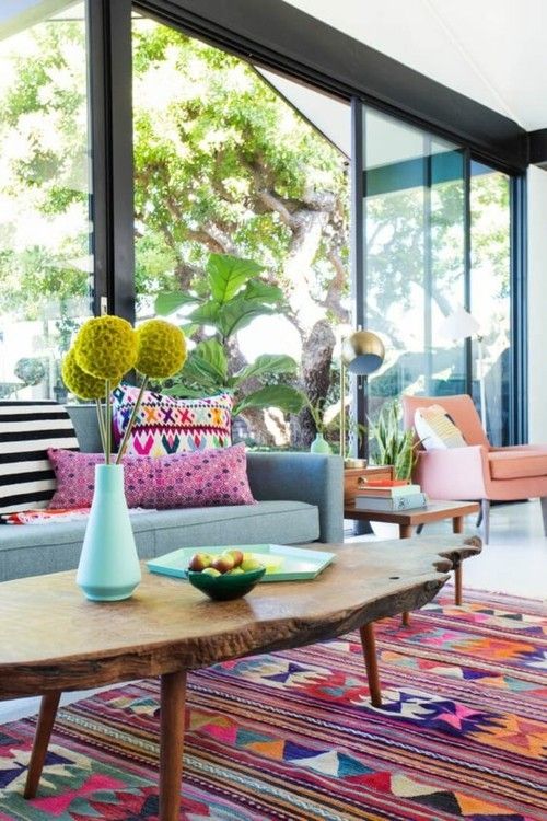
Enjoy the blaze of color of the ethnic patterns and introduce a lot of warmth into the interior design
Red and yellow
Red and yellow are generally considered warm. This also applies to most of the other shades that are added to them.
blue
Blue is the coldest color in interior design. All the nuances in which this shading is contained, as a rule, are felt in the same way.
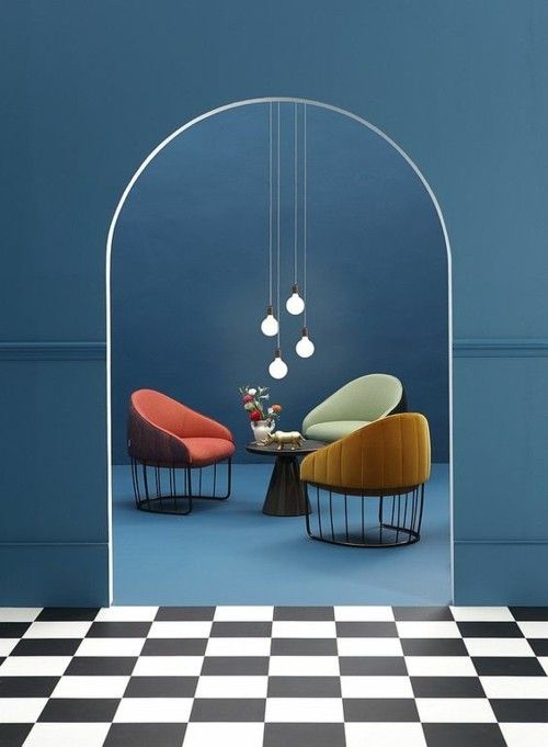
In principle, blue is considered a cold color and has to be “warmed up” with color accents
White
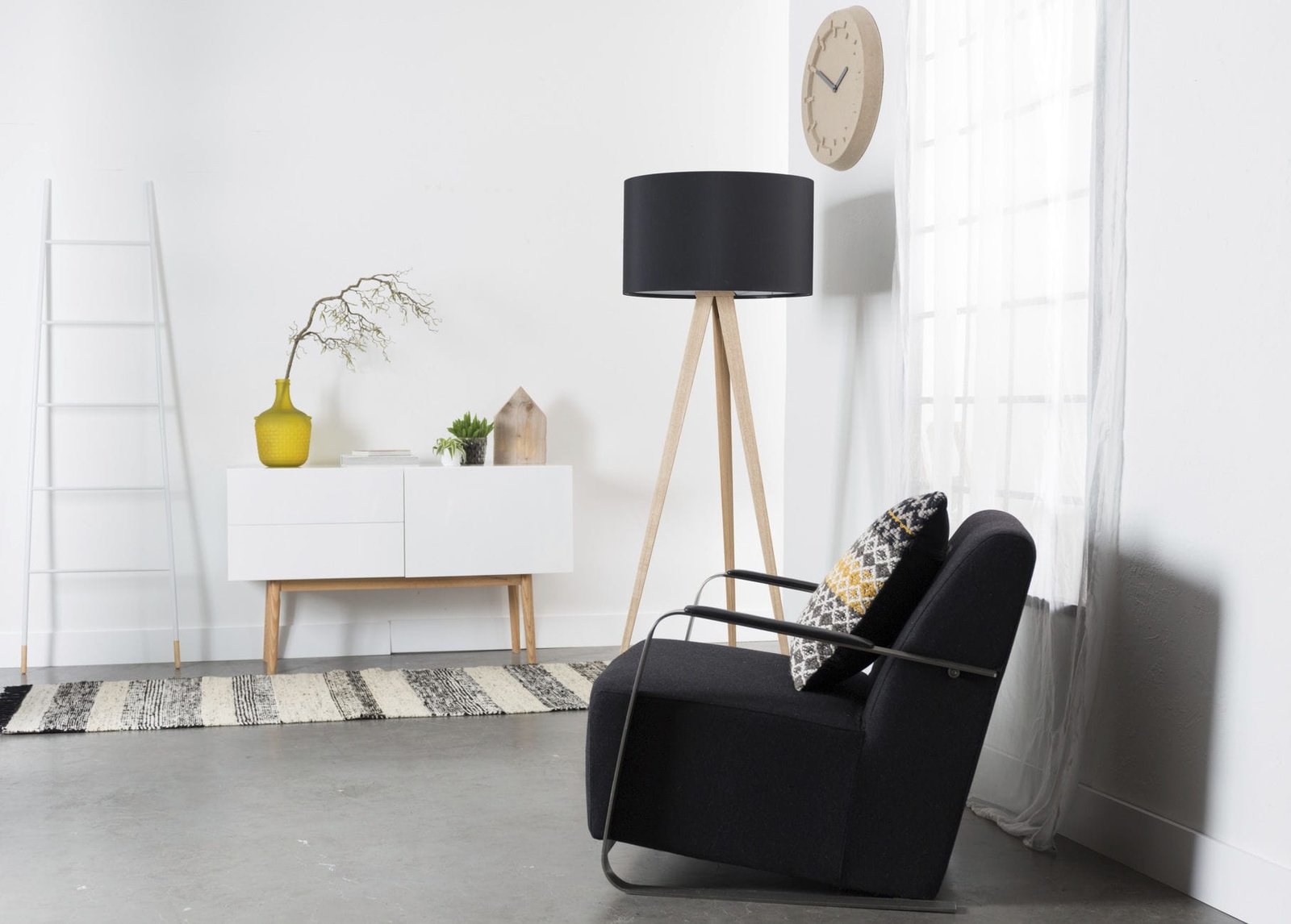
White is basically considered a cold color. At the same time, it is neutral. Most of these are also considered cold. White is used to “cool down” mixtures. As a result, some bright shades can appear colder and thus more neutral. This is very important in modern design because these very light or cool variants of the eye-catching shades are very popular.
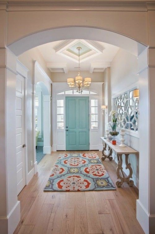
A typical white interior can be spiced up with subtle pastel colors
black
Black is believed to be a warm color. It is very often used in combination with cold shades to warm up the atmosphere in some rooms. Blue with added black would be the perfect choice if you want to choose this color for the accent wall in the living room, for example.
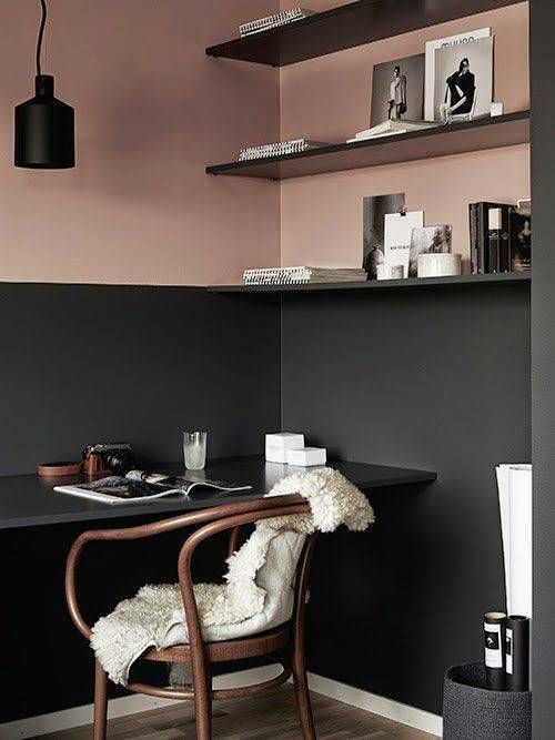
Black is trendy again and can be perfectly paired with rose gold
Green and purple
Green and purple are two colors that are typical examples of “borderline cases”. That has something to do with the colors that make them up. Green is created from blue and yellow. Whether these colors appear cool or warm depends very much on the combinations in which they appear.
The importance of cold and warm colors in practice
Well, what does all of this mean in practice? The separation between cold and warm colors plays an important role for the psychological level of the interior design. Let us illustrate this more concretely with a few examples.
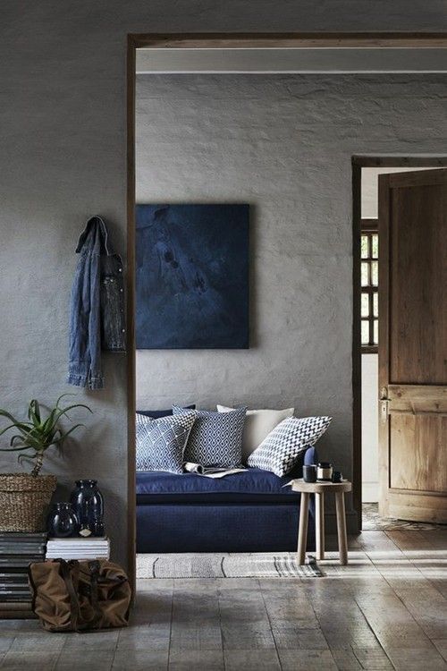
Gray is currently very popular and can be wonderfully combined with navy blue
Warm, encouraging colors
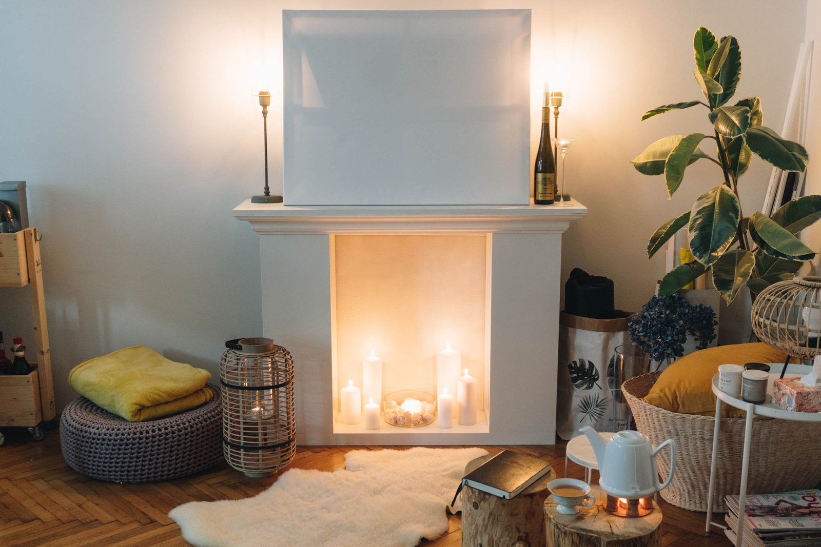
It is believed that the warm tones stimulate our senses. These make us feel more alive, but if used in excess, they can also be exhausting. In the rooms in which emotions and movement are to be encouraged, the warm colors are recommended. The kitchen and dining room would be the perfect areas for their use. In the living room they appear more often as accents. In this room the cold colors dominate because we want to relax there. But since the communicative aspect is also important here, warm accents are used.
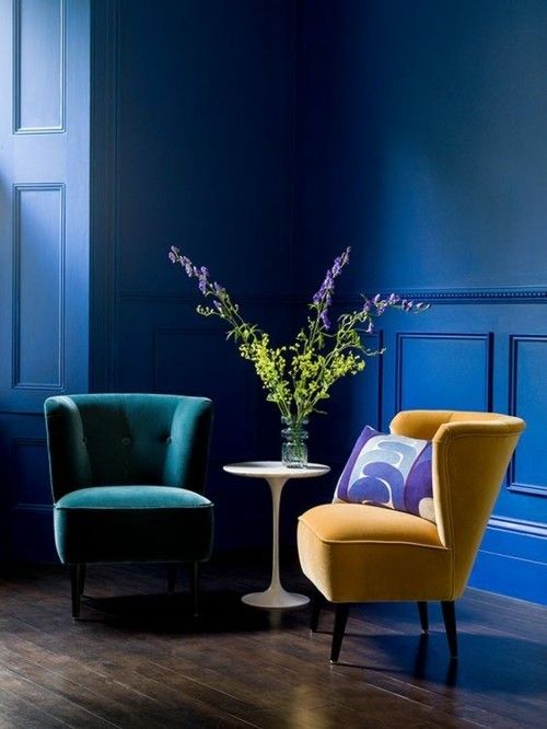
Bright eye-catchers come into their own on a navy blue background
Warm shades shrink the space and the cold – expand it
If you want to make a larger room appear smaller in a pleasant way, you can use warm colors. The extent to which this happens depends on the color intensity. If you prefer to make a small ambience appear wider, then choose a cold shade. White works best in this regard. That is why it is used very often. By skillfully using warm and cold nuances, you can emphasize one dimension to the disadvantage of another in the interior design.
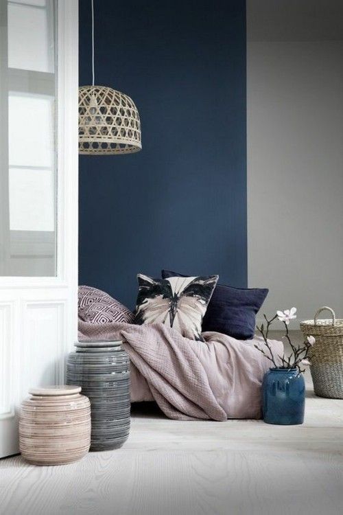
Pastel pink and navy blue go wonderfully together
Very cold or very warm interior design
With this strategy, you choose a color palette that is completely cold or completely warm. The use of mixed forms does not occur. With this strategy it is fundamentally important that all colors have the same intensity. The more different colors you use, the more beautiful the dynamics will be in the respective interior design.
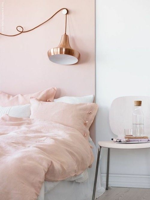
Baby pink and white in combination are the best choice for a romantic bedroom
Interior designs that allow cold and warm colors to be mixed
Mixed interior designs are usually most successful when one color dominates more than the other. Decide in advance which “heat level” should dominate in your case. Warm colors should make up the background and the others should be used as accents.
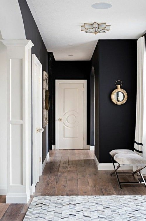
Set contrasts in the interior and achieve a striking design at home
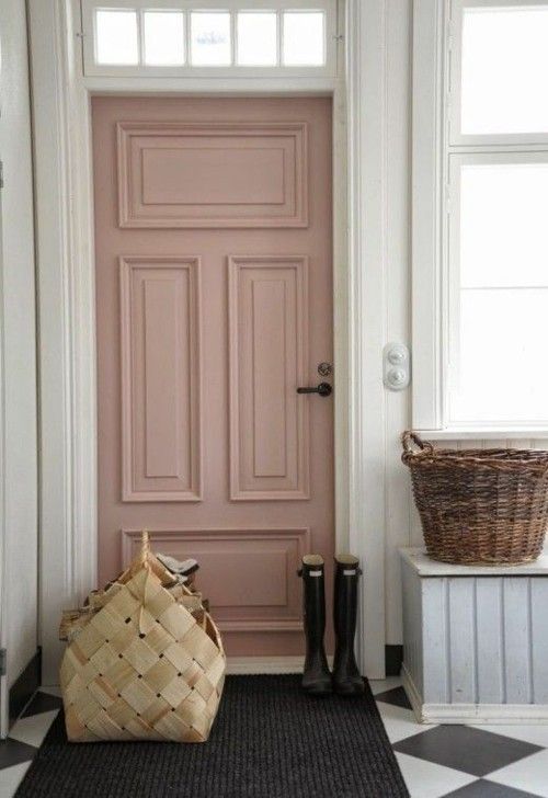
A door in pastel pink is immediately noticeable and brings a romantic touch into the interior
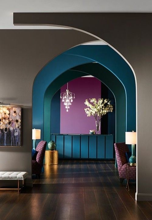
Violet and blue form an excellent mix of colors
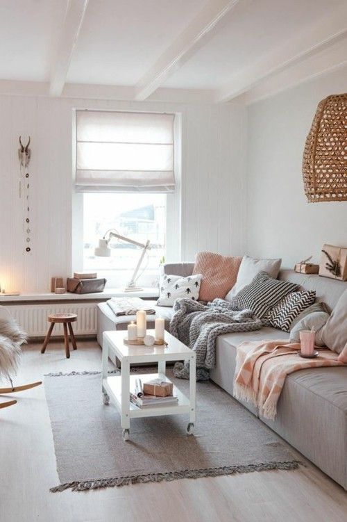
Gray is the new black if you use it cleverly
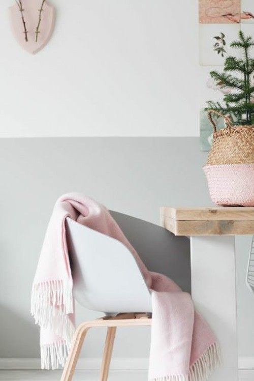
Gray and rose gold in combination for a stylish interior
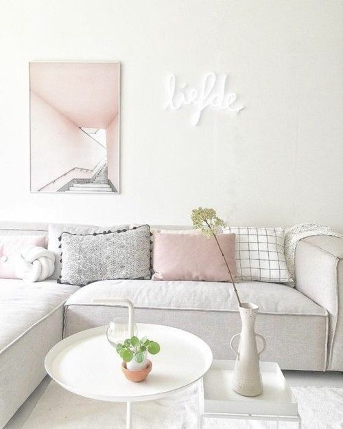
Light and inviting interior in subtle pastel colors
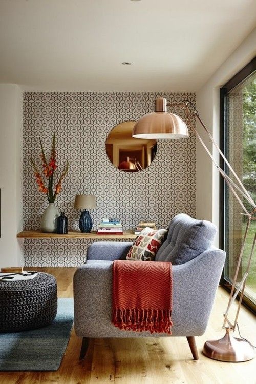
Orange and other earthy nuances warm up the interior!
Visit the rest of the site for more useful and informative articles!

