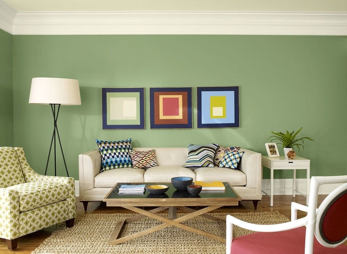
Basic knowledge of the color palettes and wall colors that everyone should have
Most of us are not interior designers by profession, and that’s a good thing. In all cases, furnishing your own home is a very responsible task. You should take them seriously in order to feel good in your own home afterwards.
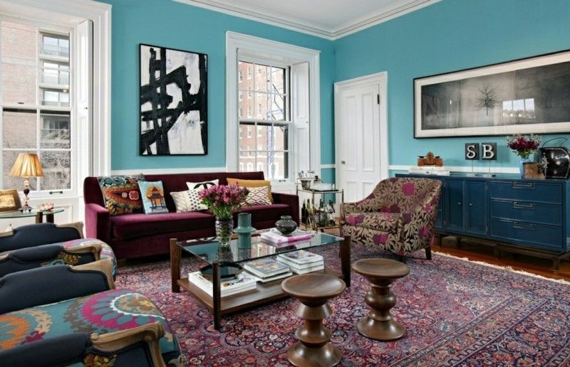
All other colors come into their own on the light blue background.
But how do you create a successful interior design? On the one hand, you need an overview of the current trends. This allows you to avoid gross mistakes, such as the unsuccessful selection of colors. Such a thing could happen especially if you lack the basic knowledge about them.
In this article you will learn everything you need to know about color palettes and the methods by which you can choose a suitable wall color from them.
Why and how do we use the color palette?
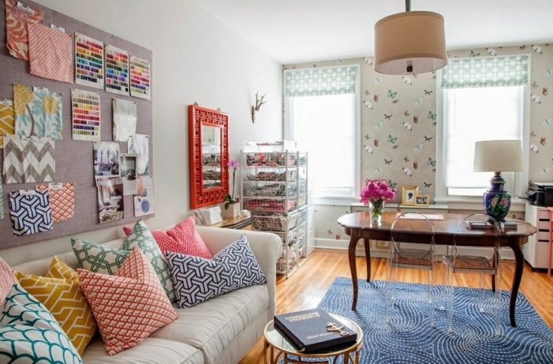
Gray is an often preferred wall color
The color palette sounds very theoretical. That’s why we seldom deal with it. However, the time for the discussion is worthwhile because it saves errors and effort afterwards.
Thanks to the color palette, you can try different combinations. The digital versions also give you the opportunity to experiment with many different mixes.
Before you do that, however, learn about the base and complementary colors. This knowledge is important for the tasteful selection of the right shades for your home.
The basic colors
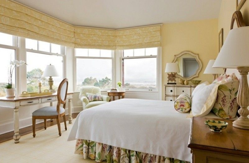
Yellow is one of the primary colors alongside red and blue.
Each color palette has at least 12 basic colors. They are divided into three groups: primary, secondary, tertiary. The first category includes red, blue and yellow. The secondary ones include orange, purple, and green. They are created through mixtures of primary colors. The tertiary arise from the pairing of primary and secondary.
Change of colors with neutrals
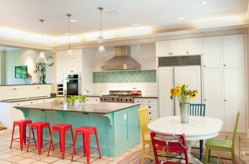
Turquoise mixed with white results in a very delicate shade
Once you have decided on a basic color, you can create many different similar variations. Thanks to the neutrals, you can lighten or darken them.
The lightening is done by adding white, the darkening can be achieved with black. It is also common to add gray. In this case you will achieve a less intense darkening than with black.
Many experts recommend the following exercise: Mix in white, black or gray with a base color until you get a feel for how much it can change its character.
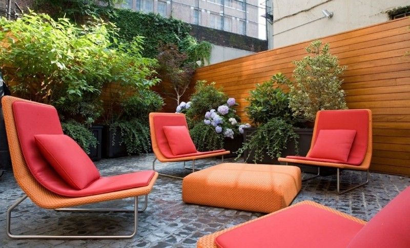
Red and orange radiate warmth and a good mood
What should we understand by “warm” and “cold” colors?
How can colors actually have a heat radiation? These are associations that are made with them. Red, orange, and yellow are often thought of as warm colors. These shades make the mood in the room more lively. Blue, green and purple are the so-called cool nuances. Associated with winter, they create a very relaxed atmosphere.
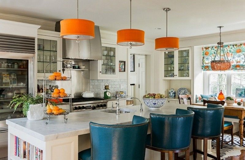
Set orange accents in the kitchen
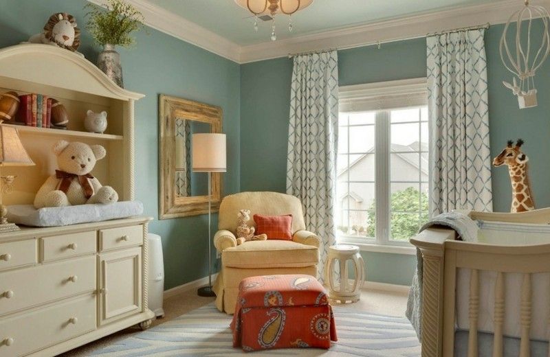
A children’s room to fall in love with
The complementary color palette
The complementary color palette is the simplest of them all. How is this actually to be understood? With the complementary color palette, you choose wall colors that are positioned against each other on the palette. In practice it is a combination of red and green, blue and orange or yellow and purple. These are the so-called complementary colors.
Using these creates very strong contrasts and you always need neutrals for more balance. This allows the eyes to rest and they do not feel tense.
Slightly different complementary color palette
Are you afraid of too strong contrasts? Here’s a way out of this situation: instead of a complementary color, choose ones that are directly to the side of it. It looks much more balanced and gentler.
This variant is most recommended when the base color is much too strong.
Analog color palette
Choose the analog color palette for your wall colors if you would like the smooth transitions to be at home. In this case, two primary colors are typically used and the third should be a mixture of the two.
The key to successful use is choosing the right proportions. In most cases the ratio 6-3-1 is chosen.
With the analog color palette, you can also only use neutral colors. Choose black, white, blue and gray in lighter variants.
Photo 8: Neutral colors predominate in this bathroom
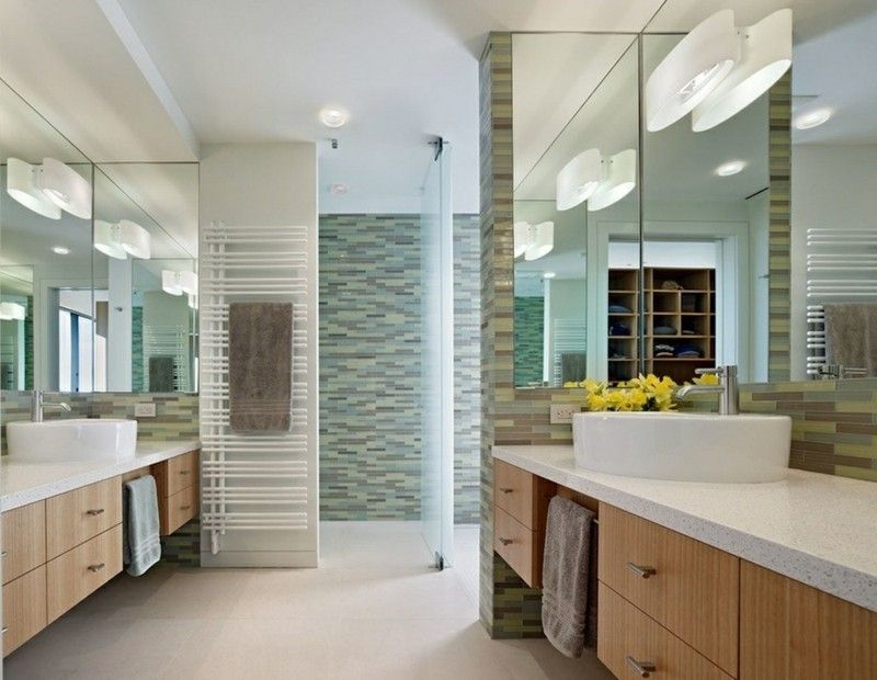
Neutral colors predominate in this bathroom
Color palette with three colors
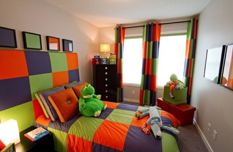
Colorful, cheerful children’s room designed in three colors
To do this, choose three colors that are the same distance from each other on the color palette. Ideally, they should be primary. Red, blue and yellow are suitable. They make a great combination with secondary colors only.
This type of wall design has a very powerful effect: it is bold and meaningful, but it can seem too taxing to some people.
Design in four or more different wall colors
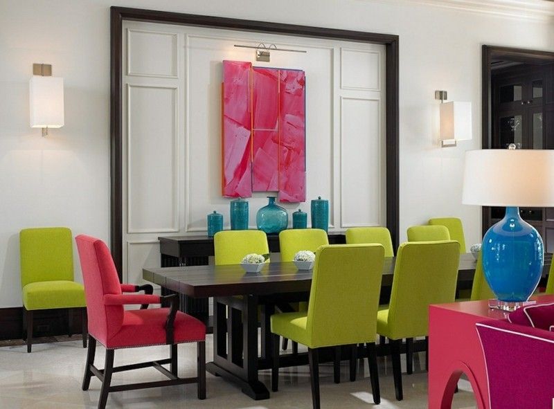
If you like it bright …
You can also use four or more wall colors and use them to design your home. The more, the bolder and more eye-catching the interior. It’s up to you how far you want to go. However, in order for it to appear successful from the designer’s point of view, these colors should be evenly distributed over the color palette.
We wish you every success with the color design of your apartment!
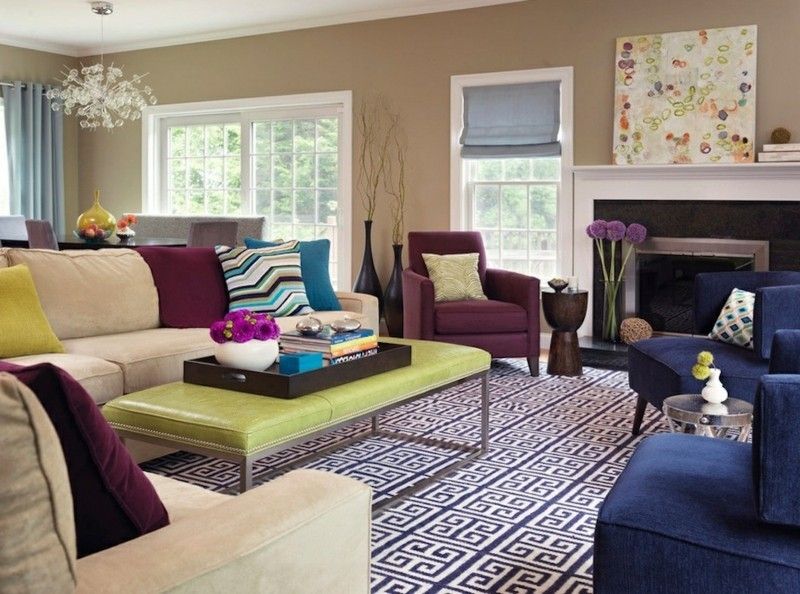
Somewhat colorful, but stylishly furnished living room
Visit the rest of the site for more useful and informative articles!

